 Back
Overview01 / 11

Retail Media Network
How I helped turn thousands of laptops across India advertise itself.
- Role
- UX Designer
- Timeline
- 1 Month
- Team
- 1 PM, 1 UX Designer, 2 Developers
Retail Media Network
How I helped turn thousands of laptops across India advertise itself.
Problem: Brands pay retail stores to showcase laptops but had no way to verify the showcasing was actually happening. They had to trust the stores’ numbers blindly.
What I did: Reframed an engineering compliance requirement into a retail media network: a theme-able, bento-grid screen system that works as ambient signage and a live sales tool, delivered in one month.
Outcome: Live across 29 states, 100 cities, 197 stores and ~3,500 machines. Brands get the verification they asked for, plus a new ad inventory channel nobody anticipated.
A brand pays a store a fixed amount per unit it keeps on display. Stores self-reported those numbers and brands had no way to verify them. At national scale, that led to brands threatening to pull subsidies and multi-brand stores favouring competitors.
Device-level tracking meant installing a lightweight background service on every demo laptop, which store staff would have to do by hand across thousands of devices.
It came to us as an operational ask, not a design brief: “we need a way to track which devices are actually on display.” The interesting work was in what we did with it next.
The tracking service would reach every demo device anyway, and those devices sit idle most of the day. The PM came around once the math held up; engineering agreed once V1 was scoped tightly enough.
A hero-led product page is weak as ambient signage; a carousel frustrates an associate looking for one detail mid-conversation.
A bento grid serves both: idle, it reads as a poster; active, an associate can jump straight to the cell that matters for this customer.
To find the answers I experimented with layouts, interactions and themes, including a distinct theme for each sub-brand: budget gaming looked different from premium gaming.
The client wanted it live within a month for an ongoing campaign, so the planned CMS-powered, per-brand system was scaled down.
In hindsight the bigger risk was shipping without instrumenting the screens. I’d push for basic engagement tracking, like taps per cell and session length, in V1.
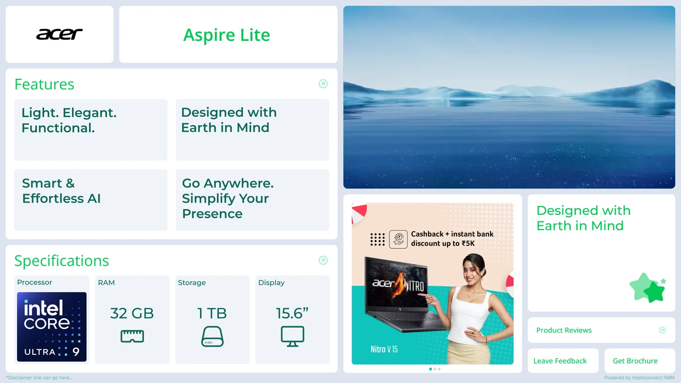
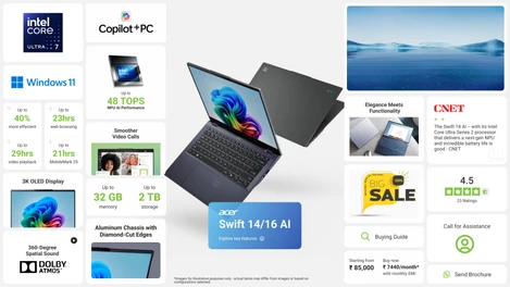
Video and standout features take the largest cells, specs the middle tier, and offers anchor the bottom. Structure is separate from skin, so new themes don’t need a new layout. V1 shipped dark for gaming and light for everything else.
Currently live in stores.
Retail Media Network
How I helped turn thousands of laptops across India advertise itself.
Role:UX Designer
Timeline:1 Month
Team:
1 PM, 1 UX Designer,
2 Developer
TL;DR
Problem: Brands pay retail stores to showcase laptops but had no way to verify the showcasing was actually happening. Brands had to trust the numbers reported by the stores blindly.
What I did: Reframed an engineering compliance requirement into a retail media network, designing a theme-able, bento-grid screen system that served as both ambient signage and a live sales tool, delivered in one month.
Outcome: Live across 29 states, 100 cities, 197 stores, and ~3,500 machines, covering 180 products. Giving brands the verification they originally asked for while creating a new ad inventory channel the original ask never anticipated. The showcase data is now fed back to brands monthly, replacing self-reported counts.
PROBLEM
PC brands display their products at exclusive as well as multi-brand stores. A brand pays a store to display a guaranteed number of its units on the floor, in exchange for a fixed payout per unit displayed.
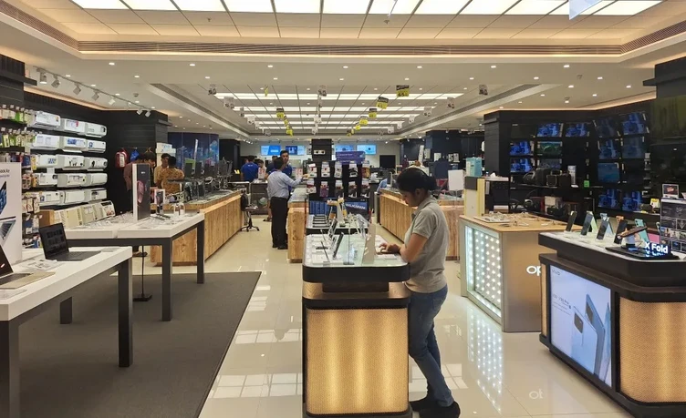
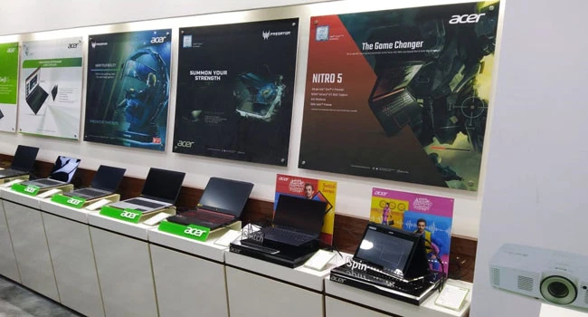
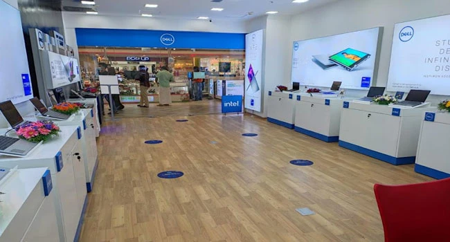
Exclusive
Exclusive
Multibrand
The arrangement only works if both sides trust the number. In practice, neither side had real visibility, stores self-reported, and brands had no independent way to verify.
This created frictions in a relationship operating at national scale: thousands of devices, hundreds of stores, dozens of brands, real money changing hands on a number nobody could confirm. And at times it reached points where either the brand was threatening to pull the subsidies or incase of a multi-brand store the stores gave better services to the competitors.
SOLUTION
The existing tool was an LMS (Lead Management System) used by store staff to log customer interest. Getting device-level tracking meant installing a lightweight background service on every demo unit, store staff would need to install it manually, at thousands-of-devices scale.









This came to us as an operational ask, not a design brief: "we need a way to track which devices are actually on the demo/showcase." The interesting work was in what we did with that ask next.
PROBLEM BEGETS OPPORTUNITY
Two things stood out to me once we understood the rollout mechanics:
I made the case to reframe the project, instead of shipping a tracking utility, we'd ship an idle-screen advertising platform, with the tracking service as the data layer underneath it.
The PM was worried about the scope creep and about getting the buy in from the client, and the developers pushed back on building more than "just tracking" in a month. I put together a rough concept and framed it as a question: if we're installing software on 3,500 machines anyway, what's the cost of doing slightly more on each one and what's the upside if it works? The PM came around when the math held up. The engineers agreed once we scoped V1 tightly enough that it wasn't a significant overrun.
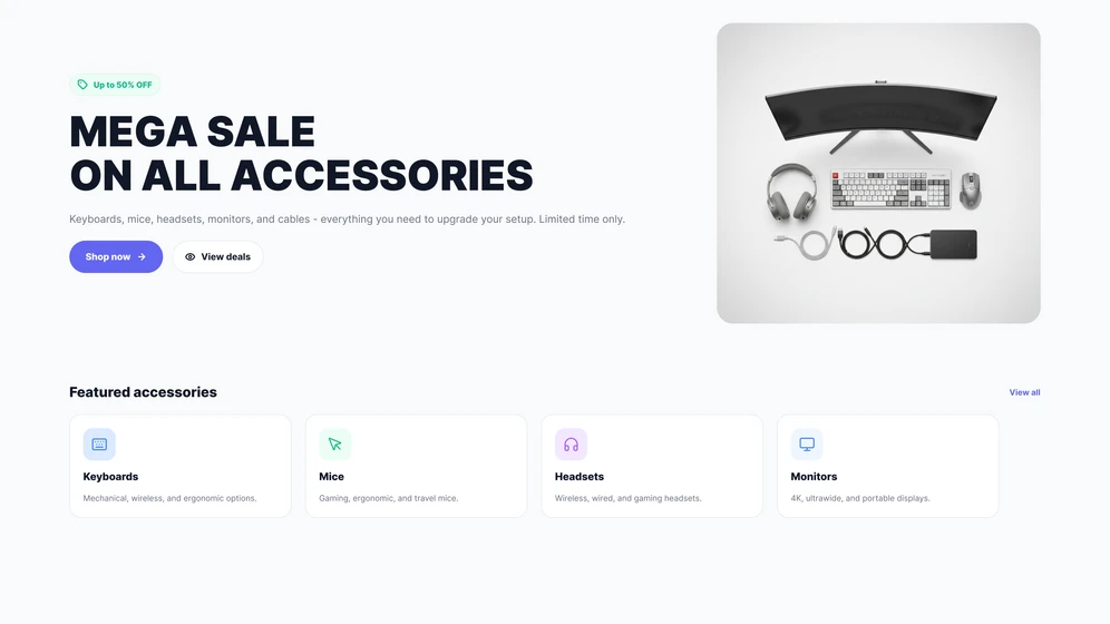
We brainstormed and debated about how to take advantage of this opportunity - Videos, advertisements, offers, technical specs, CSAT survey etc. and we had to think of the best possible way to show it, and we settled on a Bento grid layout.
WHY BENTO GRID?
I considered three approaches-
Single hero-led page (traditional PDP pattern) — strong for deep product info, weak as ambient signage.
Carousel/slideshow — good for passive idle-state attention, bad for an associate trying to jump straight to one piece of information mid-conversation.
Bento grid — the only structure serving both modes without compromise.
it also had the following advantages-
Clarity and Fast Comprehension
By compartmentalizing, important details are easily distinguishable and not lost in a text-heavy list.

Engagement and Retention
By mixing visuals with concise text, it becomes memorable than a typical spec sheet.

Visual Hierarchy and Storytelling
Strategic placement of different blocks helps convey the story better.

In idle state, the grid reads as a poster and visual hierarchy does the work, no interaction needed. In active state, an associate can jump straight to whichever cell matters for this customer, price-sensitive buyer to the offers cell, spec-curious buyer to the performance cell, instead of scrolling a linear page.
A grid lets different cells carry different weight for different moments, a single-column layout can't do that.
Although our team was aligned internally, We still had to convince our primary stakeholder (client) and I had to create concepts to bring them on board.
HAUNTING QUESTIONS
While creating concepts certain questions started haunting me

How do I balance between tech-savvy users and casual buyers who just want to know if it's "good enough"?
What would be a sweet spot regarding the amount of information to be shown?
How do I balance the information in each cards? What would be an ideal balance between images and text?
How do I maintain consistency when some laptops have standout features worth highlighting and others don't?
Do users want to see all specifications upfront or discover them progressively?
How do I reflect the brand and sub-brand values in the design?
Do I include videos, offers and promotions?
EXPLORATIONS
So in-order to find the answers I experimented...
With layouts.
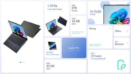
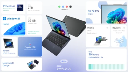
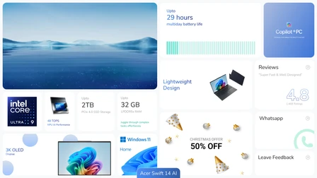
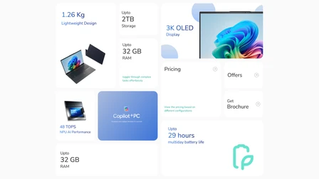
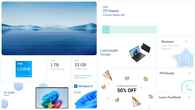
With Interactions
With brand and sub-brand story
It was important to reflect the brand and sub-brand story in the RMN experience so I experimented with having different themes for each sub brand.
The budget gaming series had its own theme...
...while the premium gaming lineup had a different theme.
Answers Found and unfound

How do I balance between tech-savvy users and casual buyers who just want to know if it's "good enough"?

Progressive disclosure: headline spec visible at a glance, deeper specs one tap away
What would be a sweet spot regarding the amount of information to be shown?
Features and product video given top priority slots; specs and offers secondary
How do I balance the information in each cards? What would be an ideal balance between images and text?
Decided case-by-case based on whether the laptop had a standout feature to hero
How do I maintain consistency when some laptops have standout features worth highlighting and others don't?
Not fully resolved, we made fallback screens to bridge the gap temporarily
Do users want to see all specifications upfront or discover them progressively?
Resolved toward progressive disclosure, headline specs readable at a glance, full spec sheet one tap away.
How do I reflect the brand and sub-brand values in the design?
Resolved via theming, but only two states shipped, not the full intended range
Do I include videos, offers and promotions?
Yes, I drafted a content specification document for brand teams defining asset dimensions, video length limits, and fallback states for when assets weren't available. This was a necessary handoff given the CMS wasn't shipping in V1.
Compromises and Constraints
Our primary stakeholders were enthusiastic about the vision we sold but was not aligned on the timeline and wanted the concept developed within a strict one month time line as they wanted it to be part of their ongoing marketing campaign drive to boost offline sales. This was not enough time to validate a bespoke experience per brand or sub-brand, we had planned a system with a complete CMS powering it. So we had to scale down our ambitious plan and play it simple.
In hindsight, the bigger risk wasn't the one-month timeline. It was shipping without instrumenting the screens. We had no way to tell after launch which cells were getting attention, which products were converting, or whether the grid hierarchy we chose was right. If I were doing this again, I'd push for even basic engagement tracking (tap counts per cell, session length) to be scoped into V1, not deferred.
FINAL DESIGN
We debated and arrived at a content hierarchy based on business priority and audience needs:
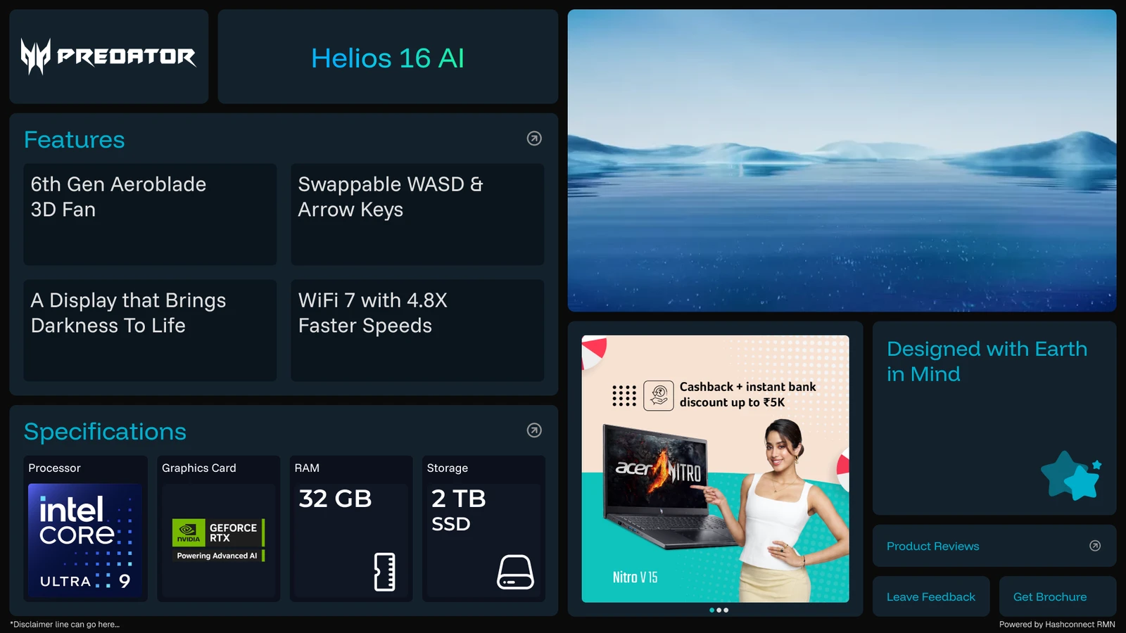
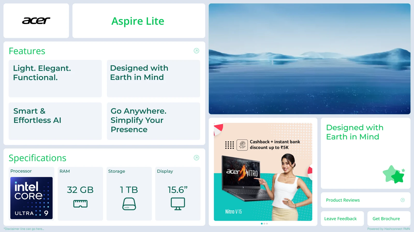
V1 shipped two themes against a one-month deadline:
The RMN experience was launched across India
States
29
Cities
100
Stores
197
Machines
~3.5K
Products
180
and is currently Live in stores.
What we don't yet have: engagement data at the cell level, or any signal from the brand side on whether the screens changed purchase conversations on the floor. That instrumentation is the first thing this product needs before V2 planning.